Drypers is a popular brand in the local diaper market, and we’ve worked closely with our customer for many years, so we know each other’s needs well. But updating the packaging this time was challenging. The customer wanted something completely new that would catch people’s attention and break away from the usual designs.
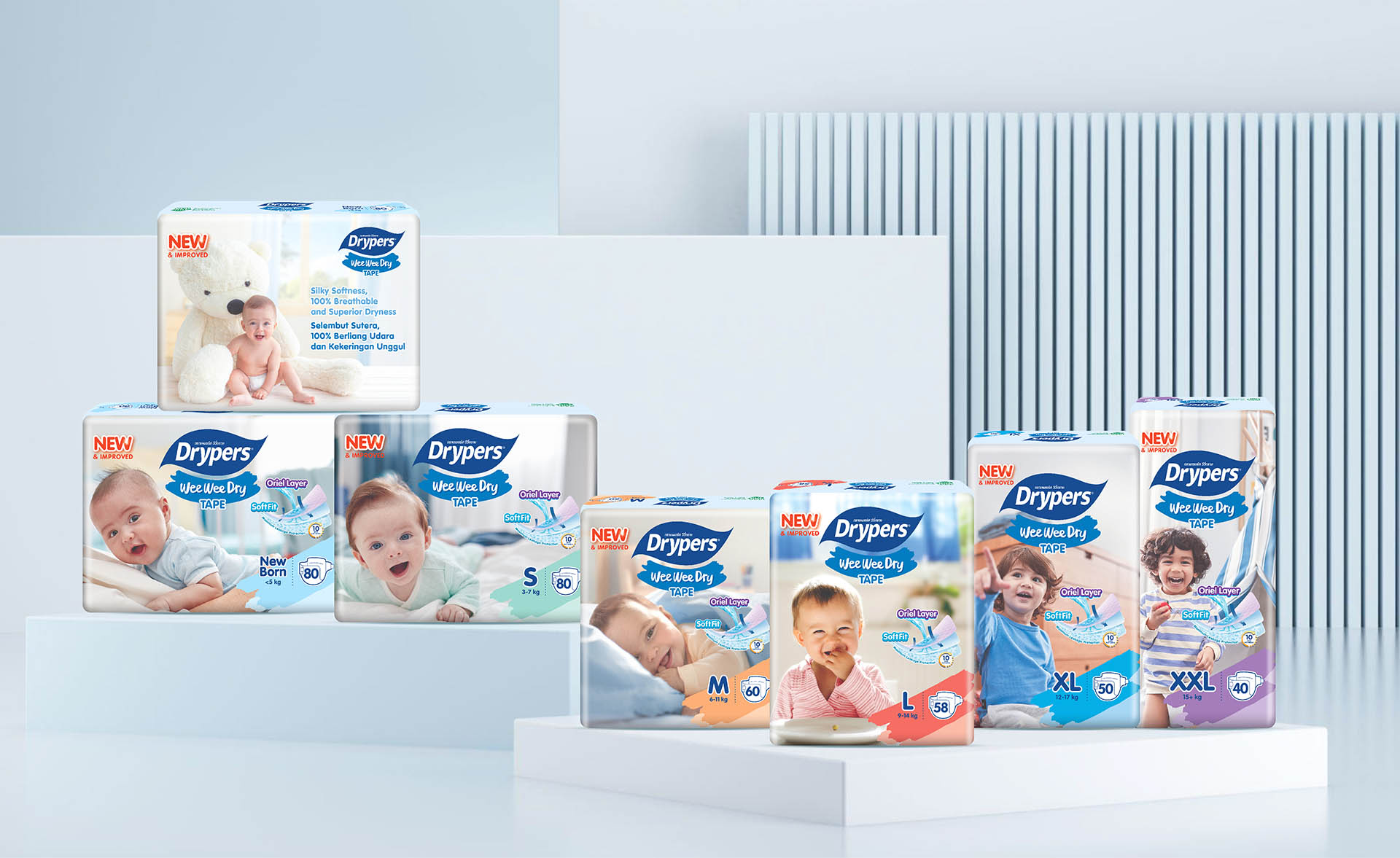
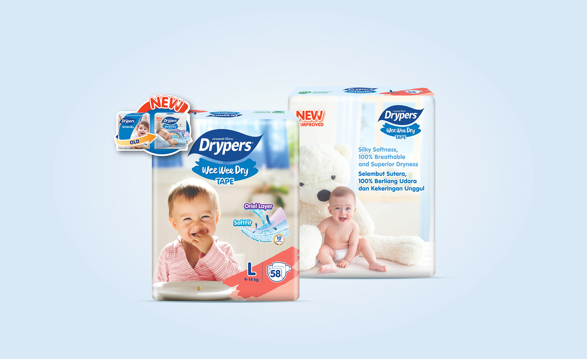
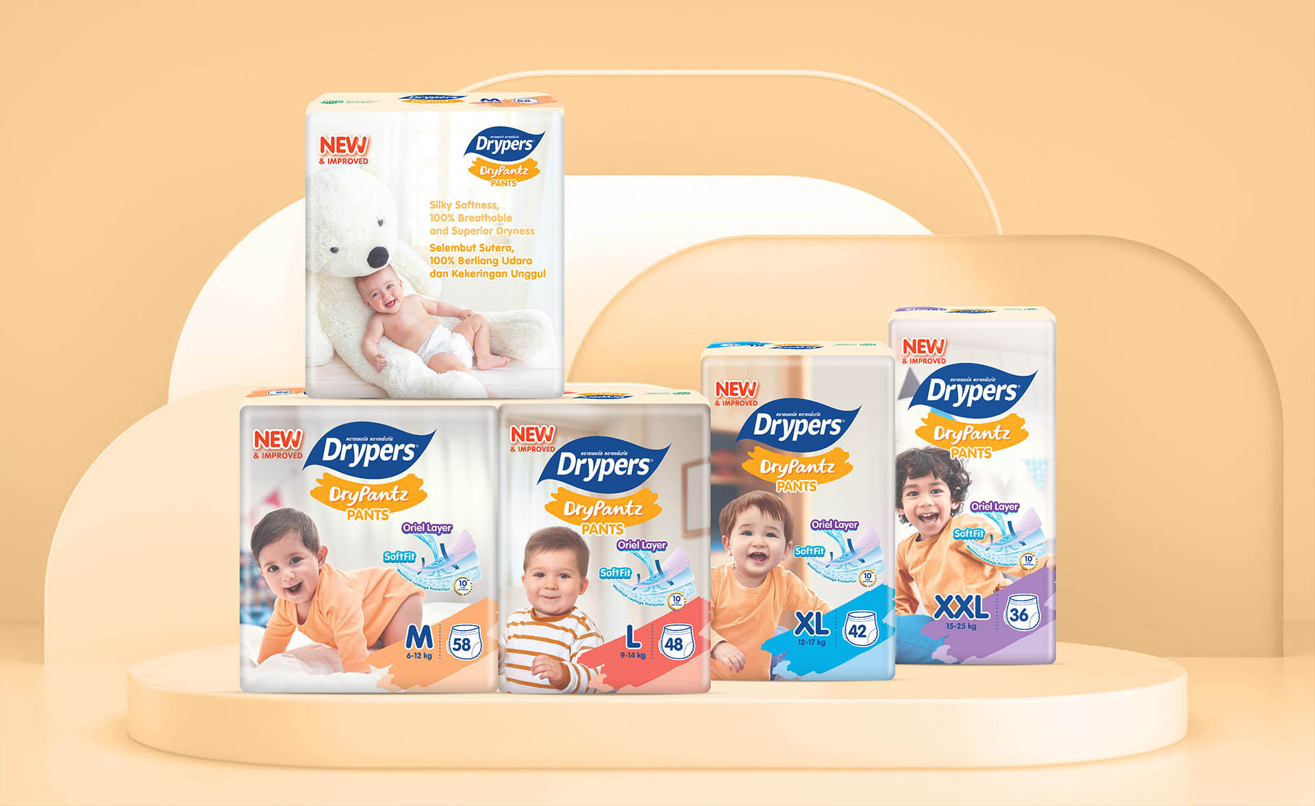
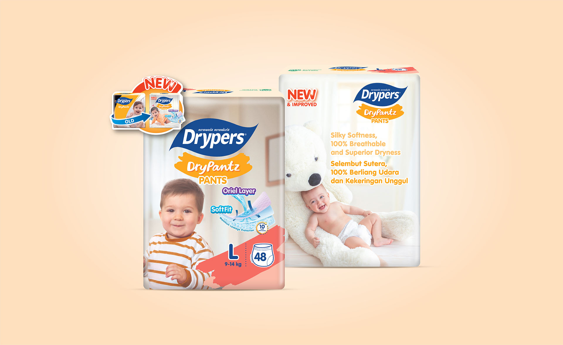
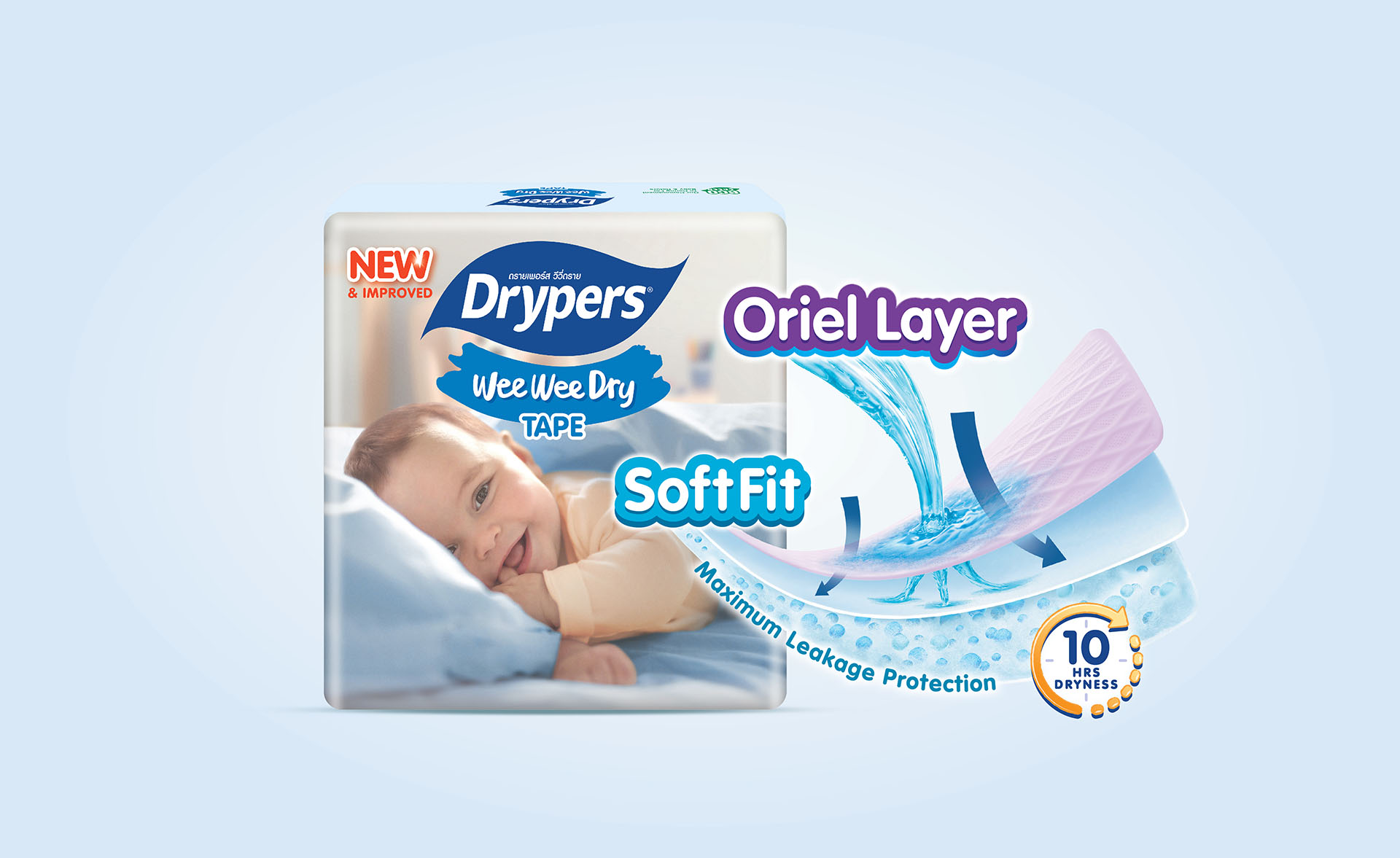
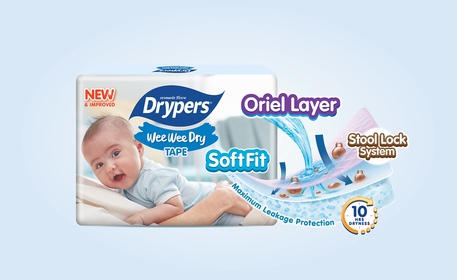
After talking with the customer many times and showing them different design ideas, we finally agreed on the new Drypers packaging you see now. We made small changes to the logo, turning the old horizontal brush stroke into a smiling shape, and used soft pastel colors for each size. On the back of the pack, we simplified things by removing detailed product descriptions and focusing more on the key features.
Drypers’s management and sales team are happy with the new packaging and have planned lots of marketing activities to introduce it to customers.